Overview
I inherited a navigation redesign that wasn't meeting teacher needs on National Geographic Learning's K-12 online platform
Through research and iterative testing, I realigned the platform's information architecture with how teachers actually work, creating a more intuitive content discovery experience
Full case study available upon request
ROLE
Lead User Experience Designer
RESPONSIBILITIES
End-to-end design
Cross-functional collaboration
TEAM
1 UX Designer, 1 UX Researcher, 1 Instructional Designer, 2 Product Managers
Approach
Benchmarking Analysis
Benchmarking revealed that teachers preferred student content first, contrary to earlier research, highlighting a clear opportunity to improve content discovery and better align teacher and student materials.
Testing Content & Navigation
I partnered with an Instructional Designer & UX Researcher to build interactive prototypes to test 2 options for content structure & 2 options for navigation.
Mirroring the structure in the print book led to a 5% increase in teacher success at finding content.
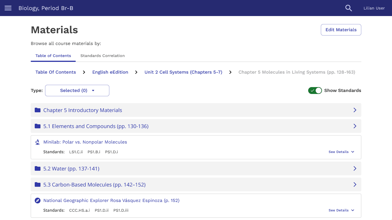
Book structure had a 58% success rate for finding content
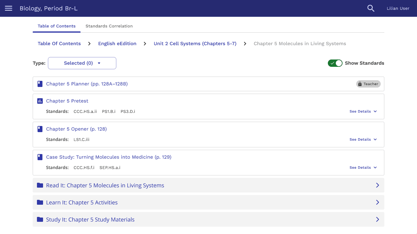
Learning purpose structure had a 53% success rate for finding content
Teachers were 27% more successful at finding content with a flatter navigation.
In the end, technical limitations and usability concerns led us to abandon this structure.
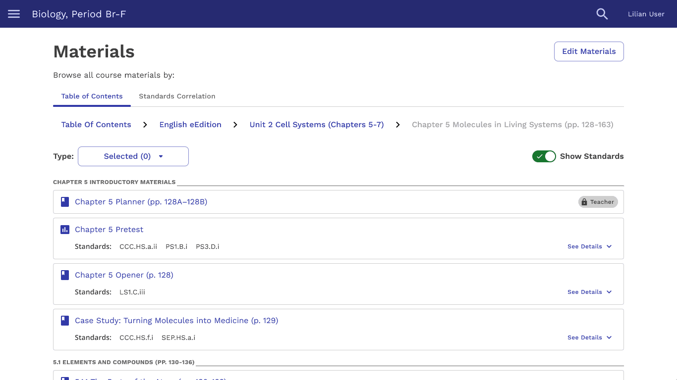
Flat navigation structure had an 85% success rate for finding content
Breadcrumb navigation structure had a 58% success rate for finding content
Testing Resource Findability
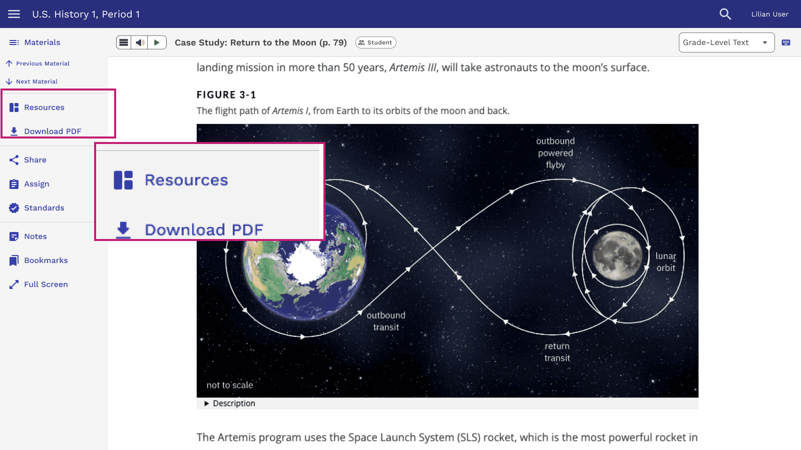
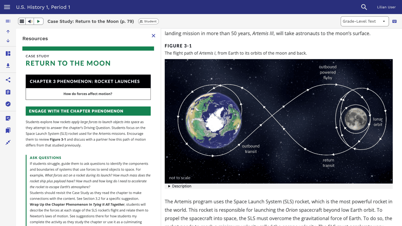
I designed a Resources button and side panel to bridge the teacher-student materials gap, but only 60% of teachers found it, indicating findability issues.
New Learning = New Perspectives
As part of my professional development, I completed a course in Object-Oriented UX (OOUX) fundamentals, which helped me see the platform and its content through a new lens.
THEME
Activity
KEY ATTRIBUTES
Name
Content
Type
Page Number
State/National Standards
KEY TEACHER ACTIONS
Assign
Review
KEY RELATIONSHIPS
Assigned to 0-M Students
Has 1-M Attempts
Has 0-M Resources
THEME
Resource
KEY ATTRIBUTES
Name
Content
Type
KEY TEACHER ACTIONS
Assign
Review
KEY RELATIONSHIPS
Associated to 1-M Activities
THEME
User
KEY ATTRIBUTES
Name
Content
Type
Page Number
State/National Standards
KEY TEACHER ACTIONS
Assign
Review
KEY RELATIONSHIPS
Student Assigned 0-M Activities
Student Granted 1-M Attempts
DEPENDENT OBJECT
Attempt
KEY ATTRIBUTES
Name
Content
Type
Page Number
State/National Standards
KEY TEACHER ACTIONS
Assign
Review
KEY RELATIONSHIPS
None because it's a dependent object
Testing Navigation Structures
I built 2 prototypes to test different information architecture models: a filtered view, inspired by eCommerce, and a hierarchical tree view.
Teachers were 90% more successful at finding content with a hierarchical tree view.
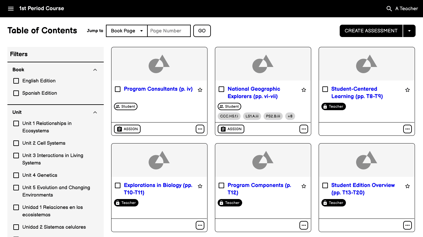
Filtered View Model that might not have happened without OOUX
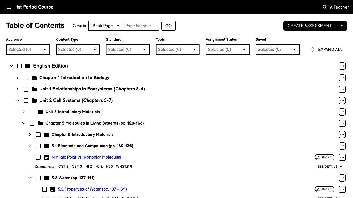
Hierarchical Tree View Model
Confirming Usability with New Tools
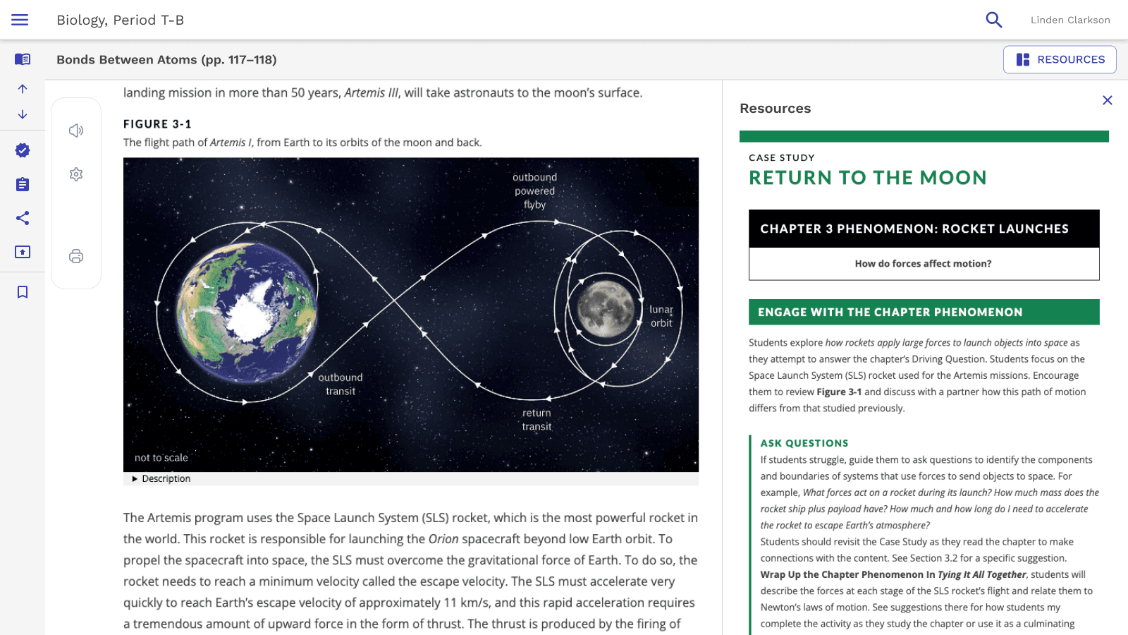
When a new reading experience was introduced, I created a high-fidelity prototype to evaluate its usability alongside a revised Resources button placement, which resulted in 100% success and improved functionality without impacting usability
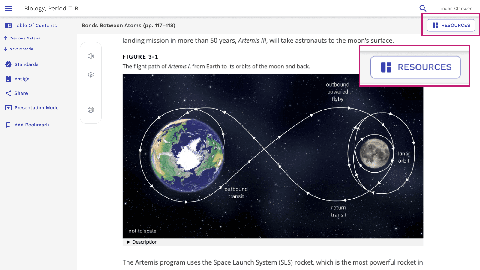
Results
The final design successfully bridged the gap between teacher and student materials while maintaining the familiar textbook-based organization that educators rely on for curriculum planning